"From all these experiences the most important thing I have learned is that legibility and beauty stand close together and that type design, in its restraint, should be only felt but not perceived by the reader." —Adrian Frutiger

The text above is fully justified with a left and right margin of 200px. Observe the spacing of words on each line and notice the inconsistency. Text justification involves aligning to the left and the right, stretching word spaces to obtain the most uniform amount of per word spacing. When the words are too "loose" it makes for a visually displeasing effect. Hyphenation is used in typography to reduce the looseness of lines. However, browsers don't hyphenate fully justified text. There have been efforts to hyphenate text using Javascript. A script called Hyphenator.js was developed to automatically hyphenate text and is available on Google Code.
On Android, using the standard TextView widget, the problem is worse. The TextView, which is a View used to display text, does not support full justification at all. This means if you wanted to make a reader application similar to the Amazon Kindle app using a TextView, you'd get text that looked like this:

The jagged right side of the text is quite unpleasant and there is much wasted space where more text could fit in the viewport. There is a fairly simple way to get full text justification on Android; it requires using a WebView. A WebView essentially is like embedding a chrome-less browser into your Android application. This means you get all the benefits of laying out text on the Web, as well as the aforementioned deficiency.

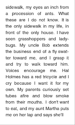 Figure 3: WebView with fully justified text Figure 4: WebView with fully justified text and hyphenation
The image on the left shows how mobile WebKit (the rendering engine which powers the WebView) lays out the fully justified text. The second image shows the layout hyphenated by the Hyphenator.js script. The use of two hyphens greatly improved the spacing for lines like "seen grasshoppers and" and "ladybugs. My uncle Bob". The hyphenated WebView text, while superior to the default TextView and the standard fully justified Web text, still has its flaws. The Amazon Kindle Android app does a better job of laying out the excerpt of Roger Ebert's "Life Itself: A Memoir".

The Kindle app does use hyphenation although it is not shown above. It clearly has a much more uniform spacing of the words though some lines are still suspect. For example: "me. Hal Holmes has a red" stands out. The difference in the WebView layout and the Kindle layout may be attributed to the difference in font type and size, margin size, line spacing etc. The WebView examples use Helvetica and I am not sure which font is being used by the Kindle app. It is also unclear whether or not the Amazon Android app is using its own layout algorithm or is using a WebView with a hyphenation JavaScript.
So it seems that the problem with full justification on the Web plagues Android because developers must use a WebView to achieve it unless they are brave enough to roll their own text justification algorithm. In case you are interested, try solving this problem from Kleinberg's Algorithm Design concerning "pretty printing" of text:

But unless you are passioned by Markov Chains or Dynamic Programming, you'll probably stick to a WebView with text-align: justify.
[Update] I've just discovered that the new CSS3 Text W3C working draft describes support for hyphenation within the browser: http://www.w3.org/TR/css3-text/#hyphenation. In fact, it's been rolled out in the latest WebKit browsers and in Firefox. I haven't tested it out yet but the usage is fairly standard:
When speaking of typography, one must consider a multitude of variables that go into the art of arranging type to display language. There is the selection of the typeface, the point size, the line length, the line spacing, the spacing between groups of letters and the space between pairs of letters. The end goal is of course legibility, however a good designer will seek a visually aesthetic expression of the language through typography. There is an emotive response that follows the sight of visually pleasing typography, it encourages the consumption of the content. Magazines, newspapers and books all have a rich history in beautiful typography.
Figure 1: Bembo text
The Web, being the new canvas for textual content, has been slowly following the lead of its dead tree predecessors. The implementation of the W3C's Web Open Font Format (WOFF) among all modern desktop browsers gives designers limitless possibility for beautiful text design on the web. Where the Web trails behind is in text justification. Full text justification on the Web is known to be flawed (See Batchelder: Bad Web Typography). Text that is fully justified on the Web may lead to terribly inconsistent word spacing that is very noticeable to the reader.
I stand here today humbled by the task before us, grateful for the trust you have bestowed, mindful of the sacrifices borne by our ancestors. I thank President Bush for his service to our nation, as well as the generosity and cooperation he has shown throughout this transition.
Forty-four Americans have now taken the presidential oath. The words have been spoken during rising tides of prosperity and the still waters of peace. Yet, every so often the oath is taken amidst gathering clouds and raging storms. At these moments, America has carried on not simply because of the skill or vision of those in high office, but because We the People have remained faithful to the ideals of our forbearers, and true to our founding documents.
Forty-four Americans have now taken the presidential oath. The words have been spoken during rising tides of prosperity and the still waters of peace. Yet, every so often the oath is taken amidst gathering clouds and raging storms. At these moments, America has carried on not simply because of the skill or vision of those in high office, but because We the People have remained faithful to the ideals of our forbearers, and true to our founding documents.
The text above is fully justified with a left and right margin of 200px. Observe the spacing of words on each line and notice the inconsistency. Text justification involves aligning to the left and the right, stretching word spaces to obtain the most uniform amount of per word spacing. When the words are too "loose" it makes for a visually displeasing effect. Hyphenation is used in typography to reduce the looseness of lines. However, browsers don't hyphenate fully justified text. There have been efforts to hyphenate text using Javascript. A script called Hyphenator.js was developed to automatically hyphenate text and is available on Google Code.
On Android, using the standard TextView widget, the problem is worse. The TextView, which is a View used to display text, does not support full justification at all. This means if you wanted to make a reader application similar to the Amazon Kindle app using a TextView, you'd get text that looked like this:

Figure 2: Android TextView left aligned text


The image on the left shows how mobile WebKit (the rendering engine which powers the WebView) lays out the fully justified text. The second image shows the layout hyphenated by the Hyphenator.js script. The use of two hyphens greatly improved the spacing for lines like "seen grasshoppers and" and "ladybugs. My uncle Bob". The hyphenated WebView text, while superior to the default TextView and the standard fully justified Web text, still has its flaws. The Amazon Kindle Android app does a better job of laying out the excerpt of Roger Ebert's "Life Itself: A Memoir".

Figure 5: Amazon Kindle Android Application
So it seems that the problem with full justification on the Web plagues Android because developers must use a WebView to achieve it unless they are brave enough to roll their own text justification algorithm. In case you are interested, try solving this problem from Kleinberg's Algorithm Design concerning "pretty printing" of text:

But unless you are passioned by Markov Chains or Dynamic Programming, you'll probably stick to a WebView with text-align: justify.
[Update] I've just discovered that the new CSS3 Text W3C working draft describes support for hyphenation within the browser: http://www.w3.org/TR/css3-text/#hyphenation. In fact, it's been rolled out in the latest WebKit browsers and in Firefox. I haven't tested it out yet but the usage is fairly standard:
p {
    -webkit-hyphens: auto;
    -moz-hyphens: auto;
    hyphens: auto;
}